A component is a ready-to-use tool you create in the studio. All components work the same way: once you master one, you master them all.
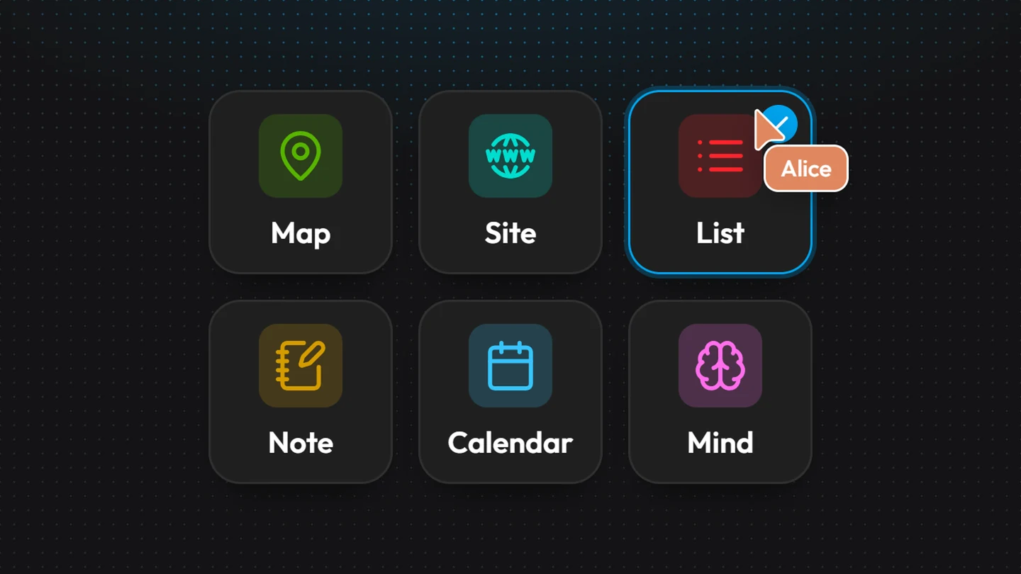
Component types
“Editable data”: on a phone, you can add and edit content, but not the configuration.
Let Kubme AI create it for you
Describe the component you want to Kubme AI: “Create a list of my customers with name, city and revenue, and fill it with 10 examples.”
What they all share
The header
Search: searches the component's content.
The title: click it to rename.
Avatars: the people (and AI agents) who have the component open right now (see Co-editing).
Configuration (gear): all the component's settings. Visible if you are allowed to edit.
Menu: favorites, Version history, Import / Export, Information.
The configuration window
Its tabs, on the left, group:
the component's own settings (columns, views, theme, settings…);
the data source: Types, Source and Model tabs (see Connectors);
Component information.
Autosave
Everything you do is saved as you go, with no Save button. Your colleagues see your changes live.
Import / Export
Menu › Import / Export opens a two-column window, Import and Export:
Accepted data formats: CSV, JSON, XML, YAML (20 MB max on import), plus ICS for Calendar, Markdown and PDF (export) for Notes, and PDF for Docs.
When importing data, Kubme asks you to match the file's columns with the component's.
Create a component
Create (at the top of All Files, a folder or a project), or right-click › New component.
In the Library, App & Components tab, pick a type, then Create.
The component is created where you are, named “Untitled”, and opens right away. To file it well, see Organizing your space.